Colour psychology is a pivotal aspect of visual arts that influences the way we perceive and interact with artistic creations. We are instinctively affected by colour, which holds the power to evoke emotions, convey messages, and even alter our behaviour. In visual arts, artists leverage the nuances of colour psychology to resonate with the audience on a subconscious level. Through their meticulous selection of hues and shades, artists orchestrate a silent dialogue with viewers, where the psychological impact of colour brings depth and meaning to the visual narrative.
Understanding how different colours impact us allows us to appreciate the layers of complexity within visual artworks. We should recognise that colours don’t exist in isolation; the interplay between them creates a context within which they can engender a multitude of responses. For instance, warm colours often evoke feelings of warmth and comfort, while cool colours may elicit calmness or sadness. When we analyse artwork through the lens of colour psychology, we gain deep insights into the artist’s intentions and the potential reactions the piece may invoke.
Our interaction with an artwork is deeply personal yet universally influenced by the cultural and social implications of colour. These implications guide our interpretation of visual cues, often aligning with shared human experiences of the world around us. As we continue to explore colour psychology in the realm of visual arts, we build a more nuanced understanding of how our artists use this powerful tool to connect with us, shaping our emotional and aesthetic experiences.
Understanding Colour Psychology
Colour psychology plays a pivotal role in visual arts, affecting the viewer’s emotions and behaviours. Through historical context and basic principles, we can better understand how colours impart meaning and influence perception.
Basic Principles
Hue, Saturation, and Brightness: These are the foundational attributes of colour. ‘Hue’ refers to the discernible colour, ‘saturation’ to the intensity, and ‘brightness’ to the level of lightness or darkness. Each attribute can evoke different responses; for example, high saturation is linked to increased energy, while lower brightness can induce solemnity.
Cultural Associations: We understand that colours carry different meanings across cultures. For instance, white is synonymous with mourning in some Eastern societies, while it represents purity and peace in many Western cultures.
Emotional Responses: Specific colours often evoke particular emotions. Red is typically associated with excitement or danger, blue can suggest tranquillity or sadness, and yellow may invoke happiness or anxiety.
By recognising these principles, we establish a foundation for leveraging colour psychology effectively in visual arts.
Colour Perception in Art
Colour perception is pivotal in visual arts as it directly influences the viewer’s understanding and emotional engagement with a piece. We consider both the scientific application of colour theory and the psychological impact elicited by different hues.
Colour Theory Application
Colour theory is integral to our work, guiding us in the selection and combination of colours to achieve harmony and balance. Primary colours (red, blue, and yellow) form the basis from which we derive all other hues. By mixing these, we obtain secondary colours (orange, green, and violet), creating a colour wheel that we often reference for complementary and analogous colour schemes. We should also account for the value, saturation, and temperature of colours, which can alter a composition’s dynamics significantly. For instance:
- Value: Lighter colours can seem to advance while darker ones recede, affecting the perception of depth.
- Saturation: Bright, intense colours can draw attention to areas of interest, while desaturated colours can serve as a restful backdrop.
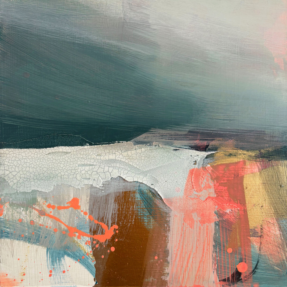
- Temperature: Warm colours often evoke energy, whereas cool colours might suggest calmness.
Emotional Responses to Colours
Colours elicit a spectrum of emotional responses that we harness to set the mood and tone of an artwork. Research suggests that red can provoke feelings of passion and urgency, while blue might be associated with tranquillity and trustworthiness. Here’s a brief overview:
- Red: Excitement, energy, danger
- Blue: Serenity, stability, sadness
- Yellow: Cheerfulness, caution, anxiety
- Green: Growth, freshness, envy
These associations are not universal, as cultural differences affect the perception of colour meaning. It is our responsibility to thoughtfully consider the psychological context in which our art will be displayed.
Influence on Viewer Engagement
In visual arts, the strategic use of colour can significantly shape how we engage with an artwork. Colour choice drives our attention and interest, while simultaneously crafting the mood and atmosphere that resonates with us on a personal level.
Attention and Interest
Colours possess an intrinsic power to affect visual hierarchy and draw the viewer’s gaze. We see bold, saturated colours often employed to create focal points within a piece. For instance:
- Red: Conveys urgency and can dominate a composition.
- Yellow: Appears bright and can inject energy into the viewer’s experience.
- Blue: Often associated with trust and can guide the viewer calmly through the artwork.
The use of contrasting colours also plays a pivotal role in maintaining interest. Artists may apply complementary colour schemes, such as blue and orange, to maintain our focus and enhance the overall visual engagement.
Mood and Atmosphere
The tonal quality of colours greatly influences the emotional response we have towards art. We perceive different hues and shades as carriers of specific emotional weights. This can even extend to the tone or material of the frames we display our artworks in.
Consider the following associations:
- Cool Colours (e.g., blue, green): Typically evoke calmness and can create a soothing atmosphere.
- Warm Colours (e.g., red, orange): Often invoke excitement or warmth, contributing to a vibrant atmosphere.
Artists leverage these colour-related associations to emotionally engage us. For instance, the use of muted colours may establish a sense of nostalgia or melancholy, impacting our psychological response and the interpretive depth with which we engage the artwork.
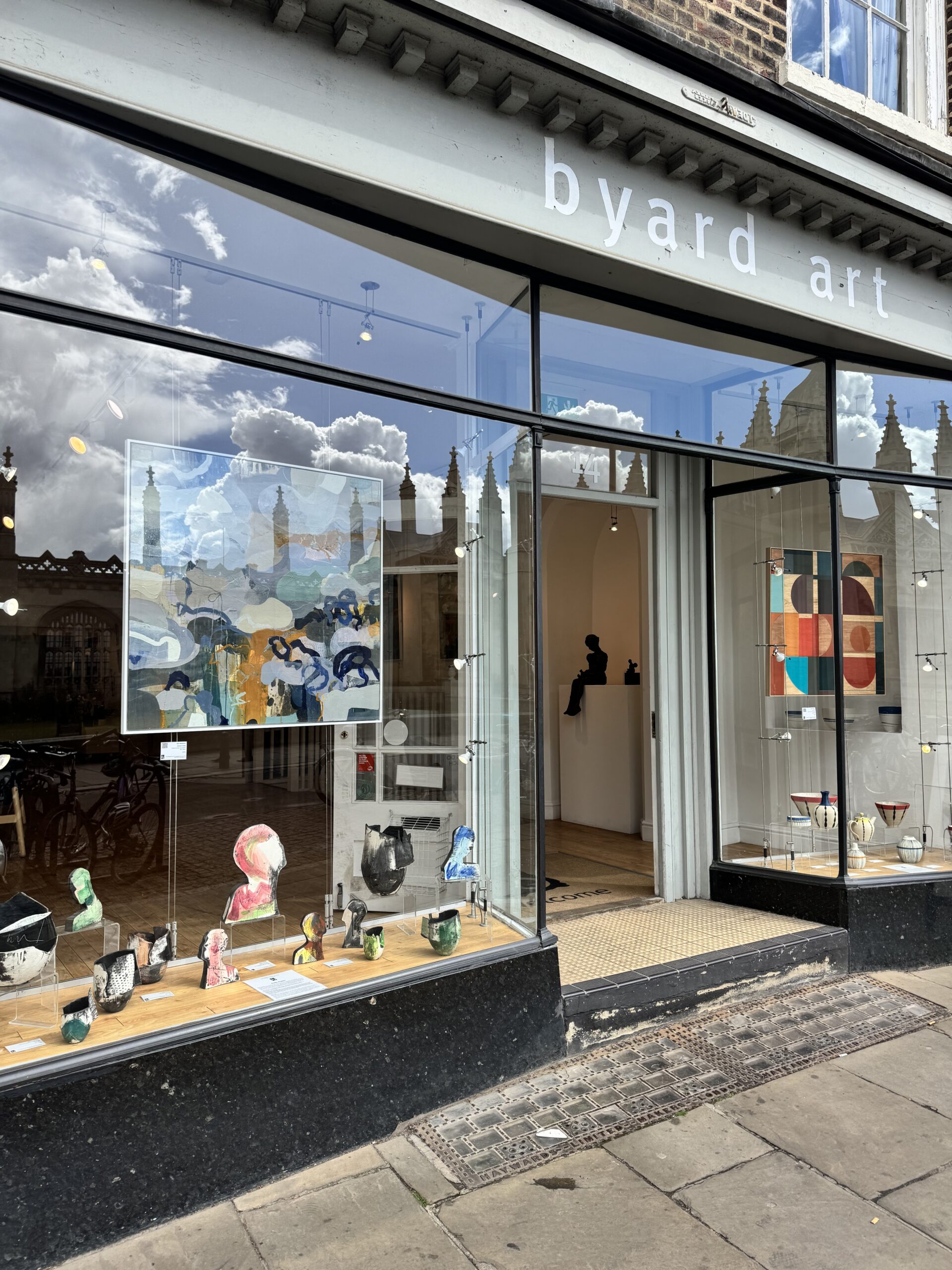
At Byard Art, we are nestled in the historic city of Cambridge. You can shop our artwork and view our upcoming exhibitions online, or visit us in-store, where we’d be delighted to arrange and oversee commissions from your favourite artists or create your own bespoke artwork frame.